Boardroom gets a behind-the-scenes look at Nuggets center Nikola Jokić’s signature logo launching later this month along with his new Joker 1 sneaker.
While his MVP-level play during the first few months of his tenth season is nothing new, Nuggets center Nikola Jokić is bringing a new element to the hardwood this year. He’s been lacing up his very first signature shoe — the 361 Joker 1 — after landing a multi-year shoe deal with the longtime Chinese brand exactly one year ago.
Throughout the last year, the brand and player worked together to create one of the first facets of a long-term shoe series: Jokic’s signature logo.
While the frequent industry standard has been to merge together a player’s initials and jersey number, Jokic’s personal icon is perhaps one of the more seamless and well-executed approaches we’ve seen in some time, as a visual representation of his longtime “Joker” nickname. It’s an elevated and evolved edition of the logo he first debuted in 2020.
After reviewing 361’s full 26-page “Personal Logo Visual Identity” document for its newest brand headliner, let’s dive into the details behind Jokic’s signature logo that will be showcased along his Joker 1 sneaker, launching this month.
The Mark
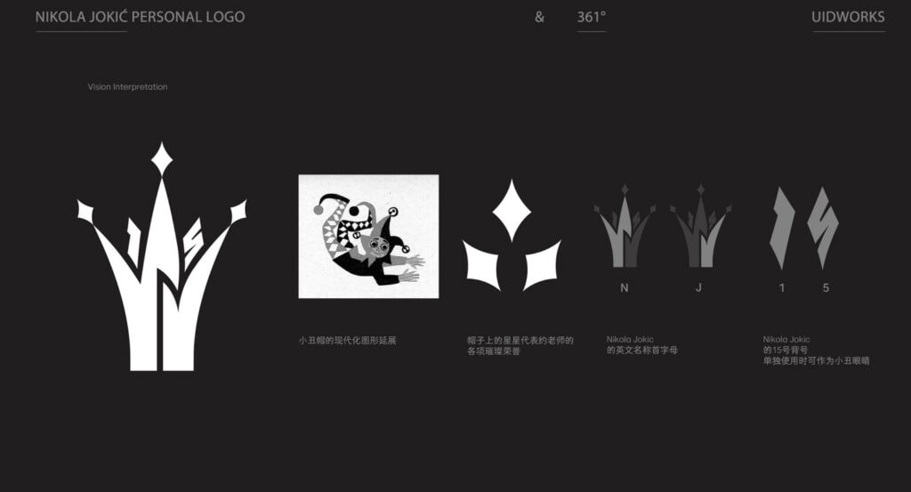
“The logo is modernized based on the symbolic elements of a jester’s hat, with stars on the hat symbolizing Nikola Jokic’s numerous honors,” reveals a 361 brand designer.
Though he will likely add to the accolades, the three stars atop the hat serve as a nod to Jokic’s three MVP awards at the time of launch for his first signature shoe. From there, his “NJ” initials make up the base of the jester’s hat. His “15” jersey number is layered in above, adding an individualized touch to the icon. Another sharper “N” serves as the split line between the two initials within the hat.
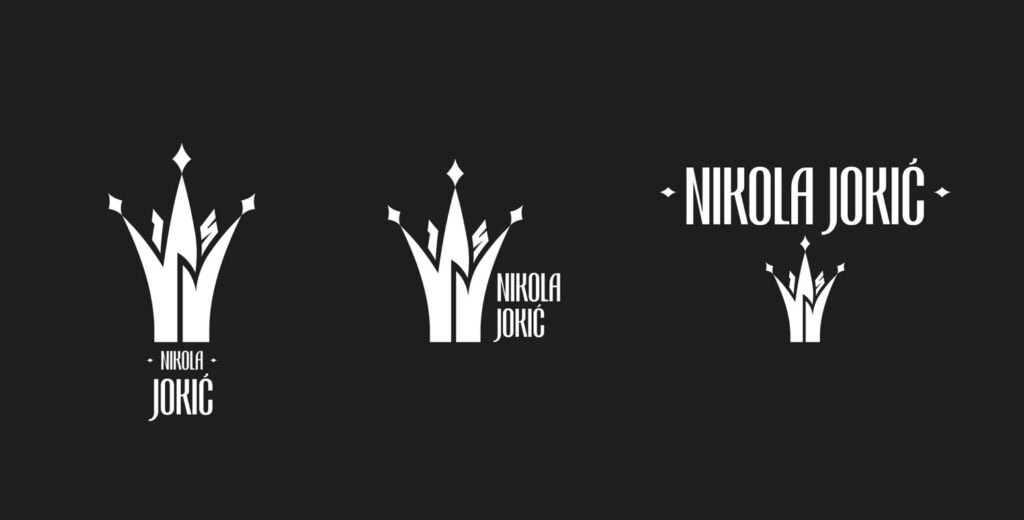
In addition to the primary logo, the brand also created a signature font type that can be locked up alongside the logo or utilized separately. For hero imagery, the logo is ideally placed in corners, inspired by a Joker’s placement on playing cards.

Specifications
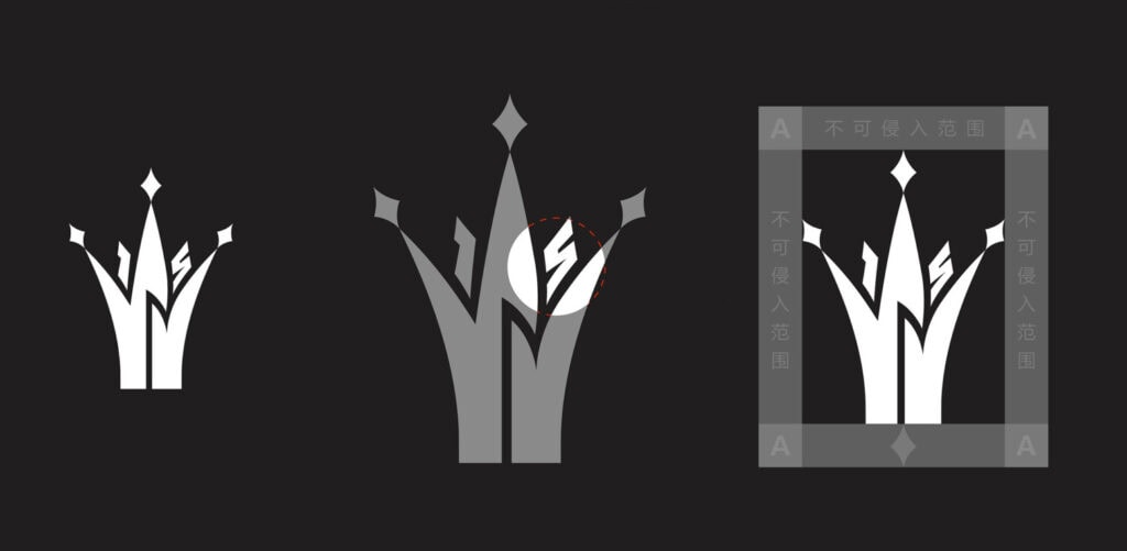
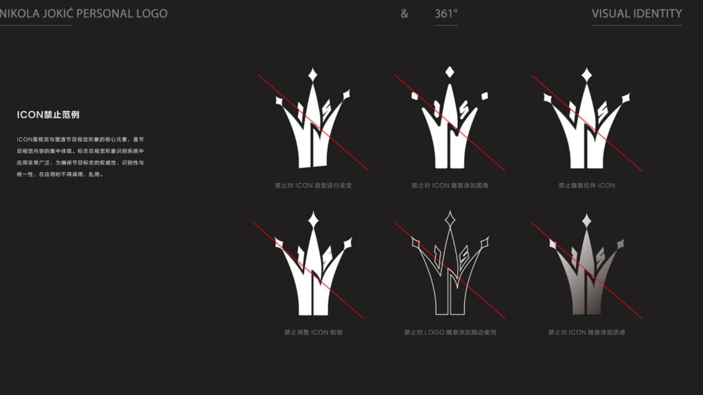
To establish the logo out the gate, as expected, the brand has a series of detailed descriptions for how to format, space and stylize the logo — “All production should strictly follow these design guidelines.”
In addition to outlining usage cases across all types of mediums — footwear, apparel, online graphics, store displays, billboards, commercials, etc — there’s an even further level of detail that highlights how not to use the logo. Don’t leave the logo hollowed, for example, or with edges too rounded. That’s all in order to ensure “authority, recognizability, and consistency,” according to the brand.
“Misuse or incorrect application of the logo is strictly prohibited,” reads 361’s internal document. It doesn’t sound like any employees want to find out what the penalties for “misuse” are.

Icon Colors
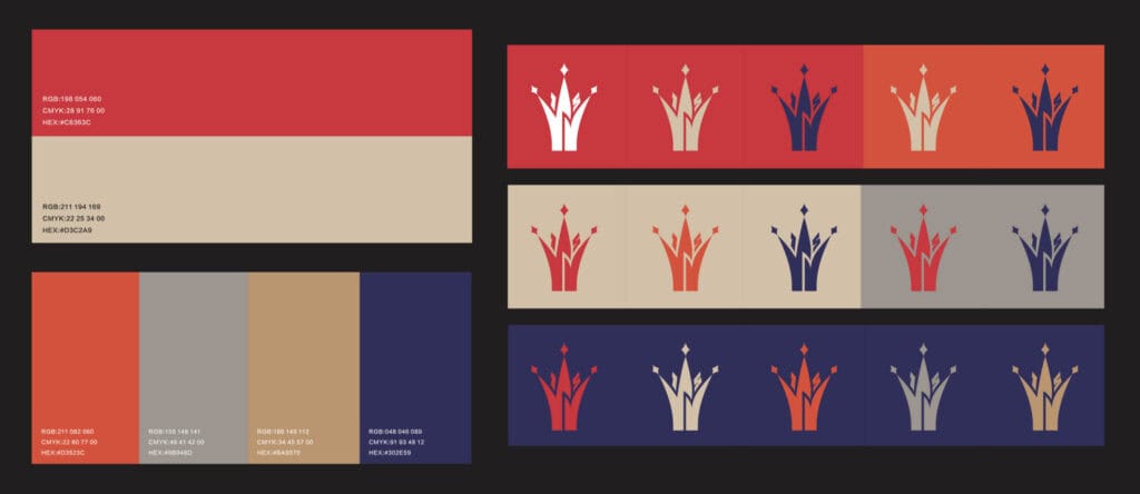
While sneaker colorways have gotten out of control over the past decade as brands look to launch sometimes dozens of themed launches throughout a given season, one thing 361 is looking to establish early on with The Joker’s first sneaker is a signature color palette.
“The color scheme is inspired by Nikola Jokic’s personal journey, lifestyle, and interests, drawing from these elements to select colors for the logo,” described the designer.
With references to his native Serbia, the mountaintops of Denver, his love of horses and even his tradition of lacing his wedding ring atop his sneakers, there’s a core approach to color that we can come to expect to see across marketing materials for Jokic’s first sneaker.

Usages
With the launch looming this month, including three initial colorways of the Joker 1 along with signature apparel, the brand will incorporate the logo across a variety of placements. The reality in this case is that Jokic himself is more known in several markets globally than 361, leading to his logo being prioritized in many cases as the partnership is established early on.
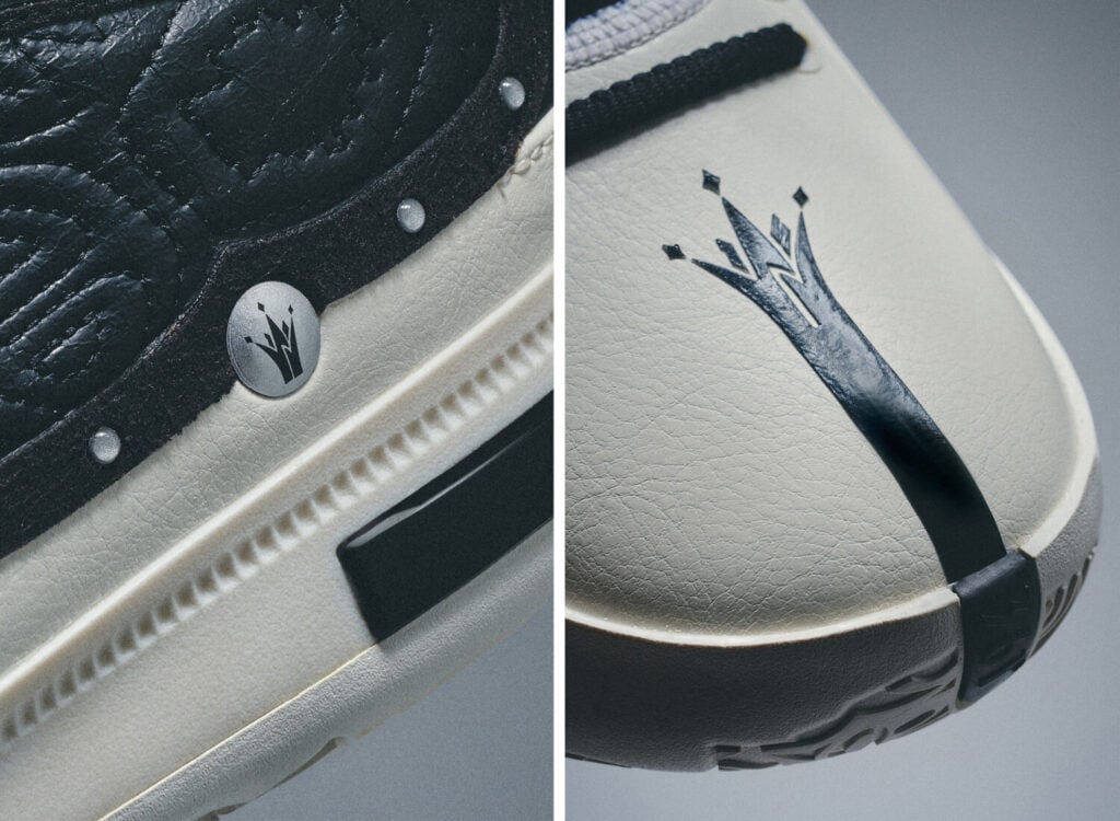
On footwear, 361’s main logo has been minimized, with the Joker icon spotted along a button towards the heel, as well as a unique placement stemming up from the toe. That’s all by design, and part of a year-long plan leading into the launch of the Joker 1 to establish his 361 signature series.
“The personal logo is a core element that represents both the character and brand essence, capturing the spirit of collaboration between the individual and the brand,” frames the brand’s key document.
