The new logos, designed by creative director Daniel Arsham, give the Cavs a fresh look with nods to the franchise’s storied history.
It’s a new era in Cleveland. Visually, at least.
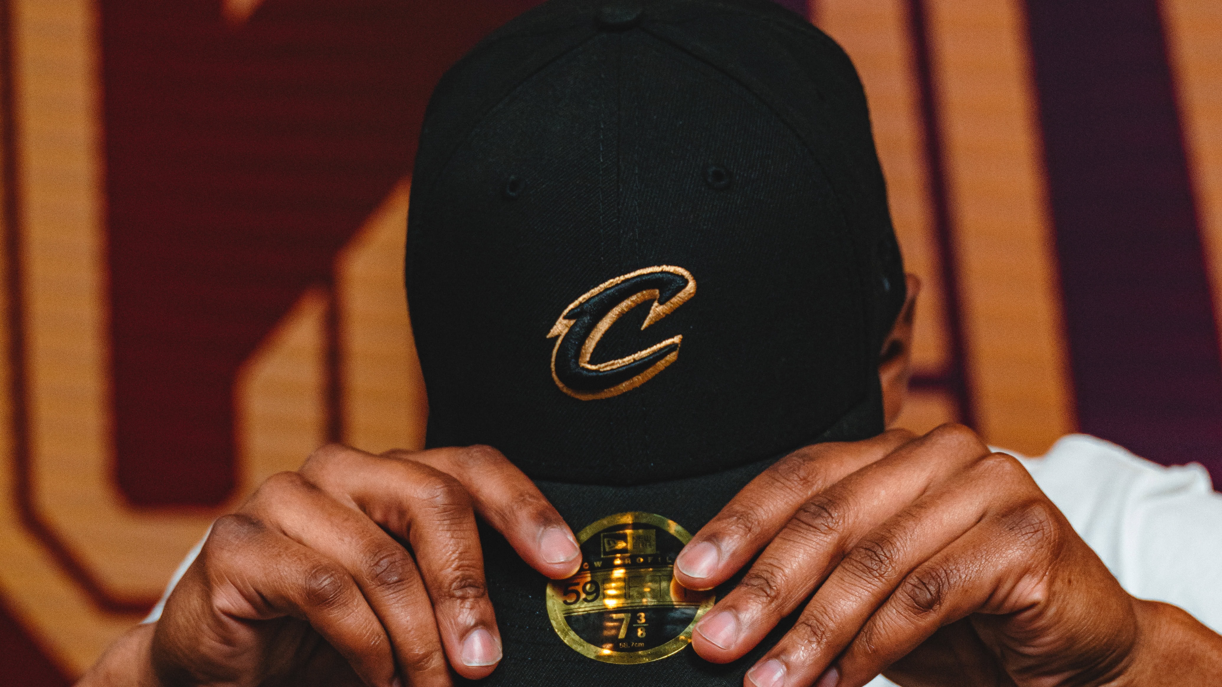
The Cleveland Cavaliers unveiled their new, refreshed logo and brand identity on Thursday, making a series of subtle but notable changes to their previous look. The franchise removed the sword from its shield-like crest logo, brought back its iconic hoop V, and swapped its mustard yellow color for a gold that originated with the team in the 1980s and returned during the first LeBron James era between 2003 and 2010.
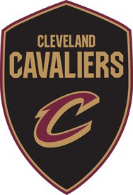
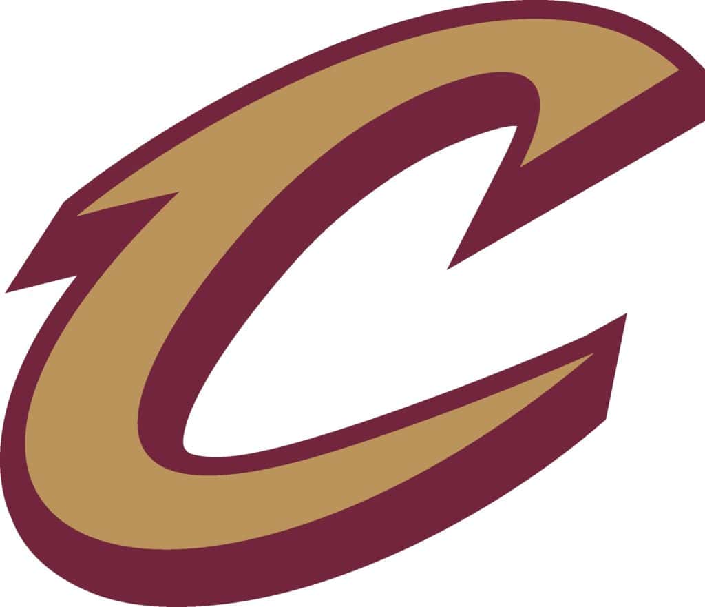
The three new iterations can be seen here, courtesy of the Cavs:

Cavs creative director, Cleveland native, and internationally renowned artist Daniel Arsham led the re-design for an identity package that feels fresh, yet familiar. A new brand identity that references different eras of the franchise is something he has been thinking about since he took the post in 2020.
“Frankly there were way too many options,” Arsham told Boardroom. “And my feeling is if we’re trying to create a cohesive brand identity, it needs to be relatively simple and reductive.”
What was originally a couple dozen iterations of team logo graphics was cut to about 10 over the last two seasons. It’s now been reduced to just three, including a significantly reduced color palette that eliminates navy from the team’s scheme.
“It feels like our team, especially after last season, came into its own,” Arsham said. “It’s a new team, a lot of young players, and it feels good to be able to give them a new mark that they can get behind and own while still paying homage to previous eras in our history.”
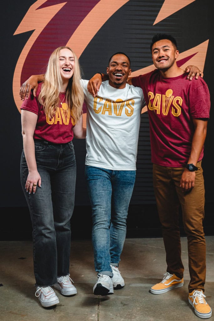
The reduction of the color palette reinforces Cleveland’s primary colors of wine, black, white, and Cavaliers Gold— also known as Pantone #BC945C— that’s replacing the mustard yellow the Cavs have used in recent years. There will also be a reflective silicone-like material on the gold when applied to the team’s jerseys that will give it a unique kind of sheen when watching the team on TV.
“Frankly, I was never a huge fan of the mustard yellow to represent the gold,” Arsham said. “I didn’t like the way it really sat with our wine.”
Black was always going to stay as a Cavs color, Arsham said. It’s one that the fans like, the players feel good in, and was a major part of the team’s 2016 championship run. There will also be new Cavs Statement, Icon and Association jerseys that will be unveiled later this summer, with a new City Edition uni debuting in November with the rest of the league.

“Our jerseys are going to look so different from so many others in the league just based on their simplicity,” Arsham said. “I haven’t done any flashy details, no piping on the edge of the sleeves, or a trim, or anything like that. They’re solid jerseys. They almost look like something from a different era — from the ’70s or something like that.”
Arsham hopes that people feel like they’ve seen the logo before but also that it’s a new interpretation of a clean and simplified look.
“It looks contemporary, it’s reductive and simple but modern at the same time,” he said. “I think it checks all those boxes for me and personally I think the reaction from the community is going to be quite good.”